
I’m a long time user of the Contextual Related Posts plugin for WordPress.
The thing is that if you activate thumbnails, you’ll end up with this kind of ugly list:

So I’ve written some CSS to beautify this, and make the final result aligns with TwentyEleven (WordPress default theme):
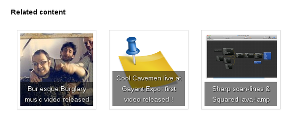
And here is the CSS producing the result above:
#crp_related ul {
    list-style: none;
    float: left;
    margin: 0;
}

#crp_related li,
#crp_related a {
    float: left;
    overflow: hidden;
    position: relative;
    text-align: center;
}

#crp_related li {
    margin: .9em;
    border: 1px solid #ddd;
    padding: 6px;
}

#crp_related li:hover {
    background: #eee;
    border-color: #bbb;
}

#crp_related a {
    width: 150px;
    height: 150px;
}

#crp_related a:hover {
    text-decoration: none;
}

#crp_related img {
    max-width: 150px;
    margin: auto;
}

#crp_related .crp_title {
    position: absolute;
    height: inherit;
    bottom: 6px;
    left: 6px;
    padding: 3px;
    width: 144px;
    /* = 150px - (3px * 2) */
    color: #fff;
    font-size: .9em;
    text-shadow: #000 .1em .1em .2em;
    background: rgb(0.5, 0.5, 0.5);
    background: rgba(0, 0, 0, 0.5);
}

#crp_related li:hover .crp_title {
    background: rgb(0.2, 0.2, 0.2);
    background: rgba(0, 0, 0, 0.8);
}
I’ve integrated this CSS code via a widget, using the same technique I’ve detailed here .
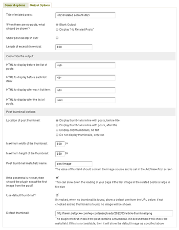
This CSS was tested against the version 1.7.2 of Contextual Related Posts , and for reference, here is my plugin configuration:
And FYI, my post default thumbnail is from KDE’s
Oxygen icon set
, which I found on my system in
/usr/share/icons/oxygen/128x128/apps/knotes.png
.